Websites, Videos & Photos
View examples of my work and email ian@iodigitalmarketing.com to get started.
Video Projects:
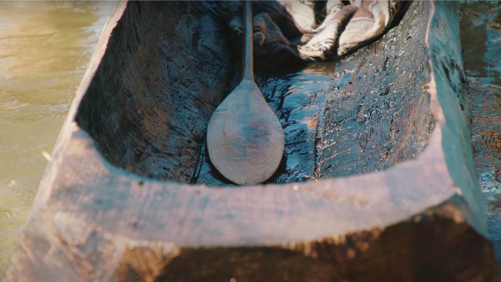
NHA - Making of a Mishoon
Short Documentary (Oct 2021)
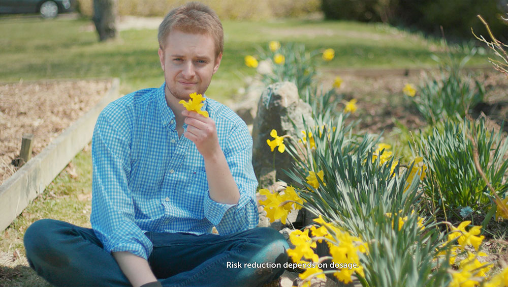
Social Distancing
If Social Distancing Were a Pill (April 2020)

Ray Rickman Ad
Elect Ray Rickman (Sep. 2021)
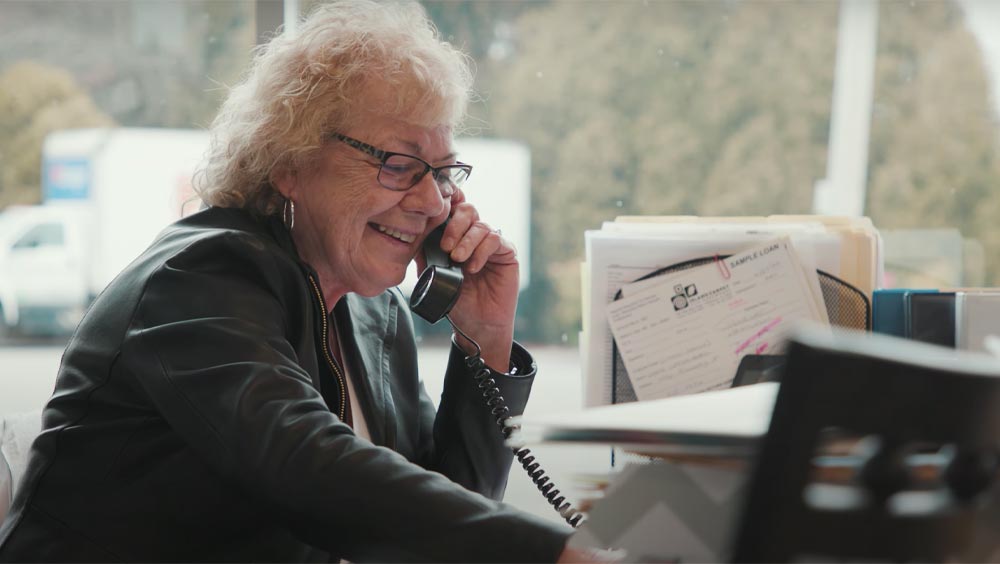
About Us Video
Island Carpet (Oct 2020)
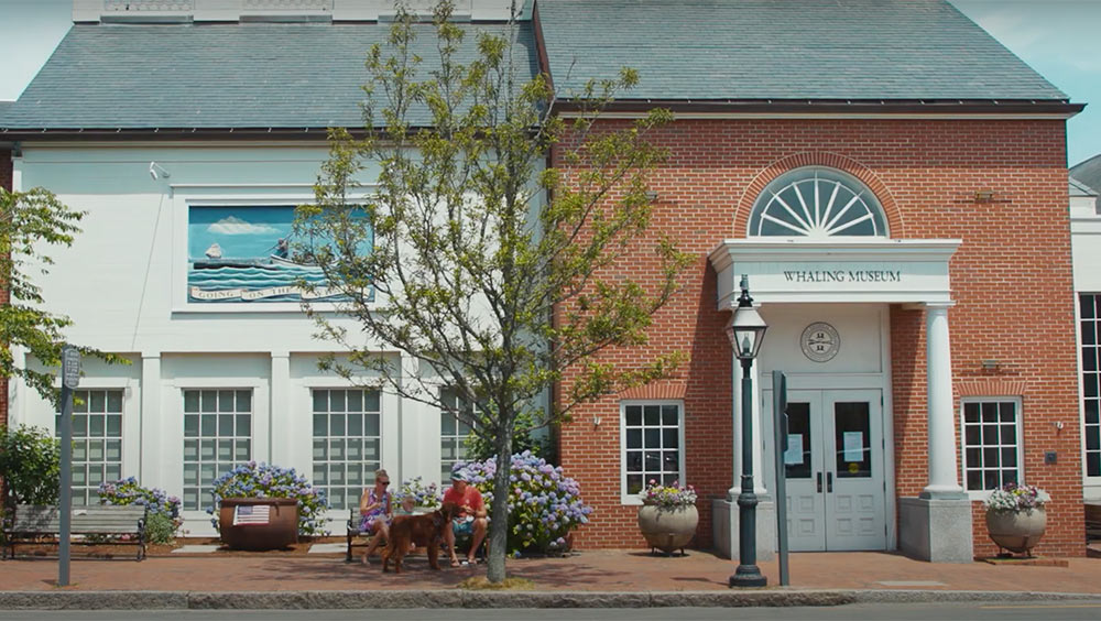
NHA - Museum Tour
Whaling Museum Tour (July 2020)

How to Clean Carpet
Flooring America (May 2021)
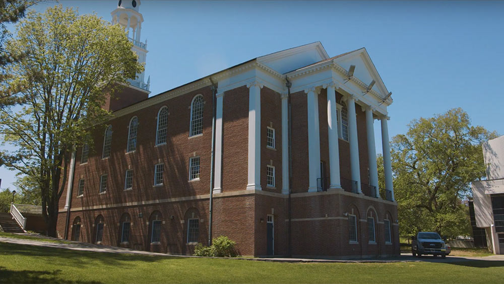
Wheaton College
The Center of Social Justice & Comm. Impact (June 2019)

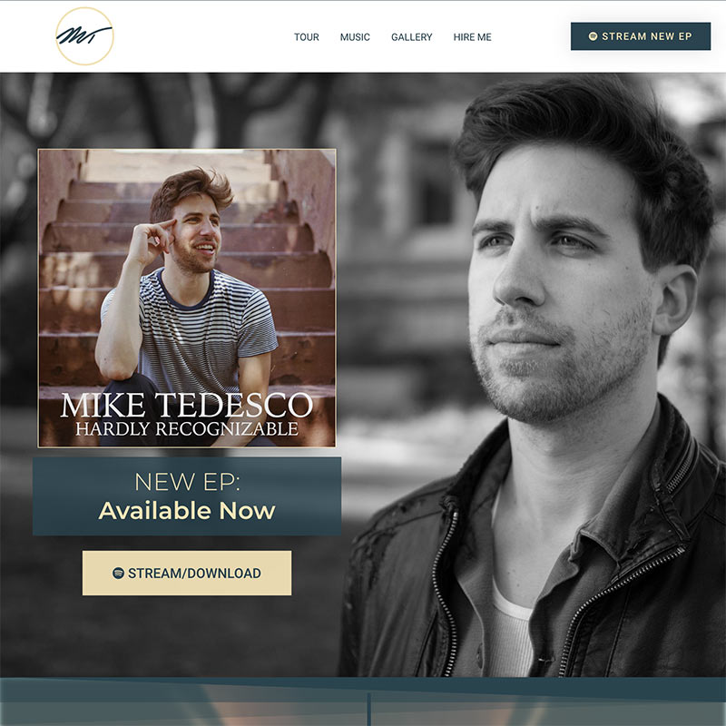
Mike Tedesco
Ghost - Nantucket Sessions (August 2019)

What is Ceramic Tile?
Flooring America (July 2021)
Website Projects:
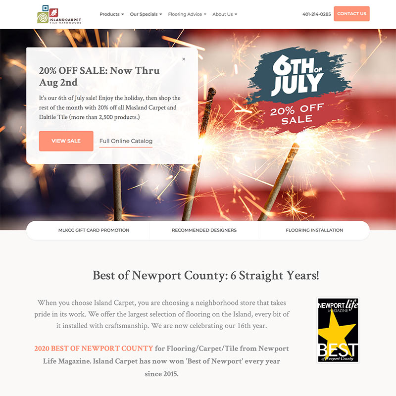
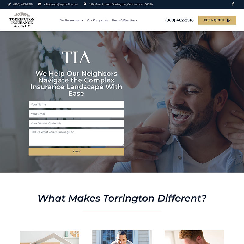
Island Carpet
Flooring Store in RI

Paracca Interiors
Flooring Store in PA
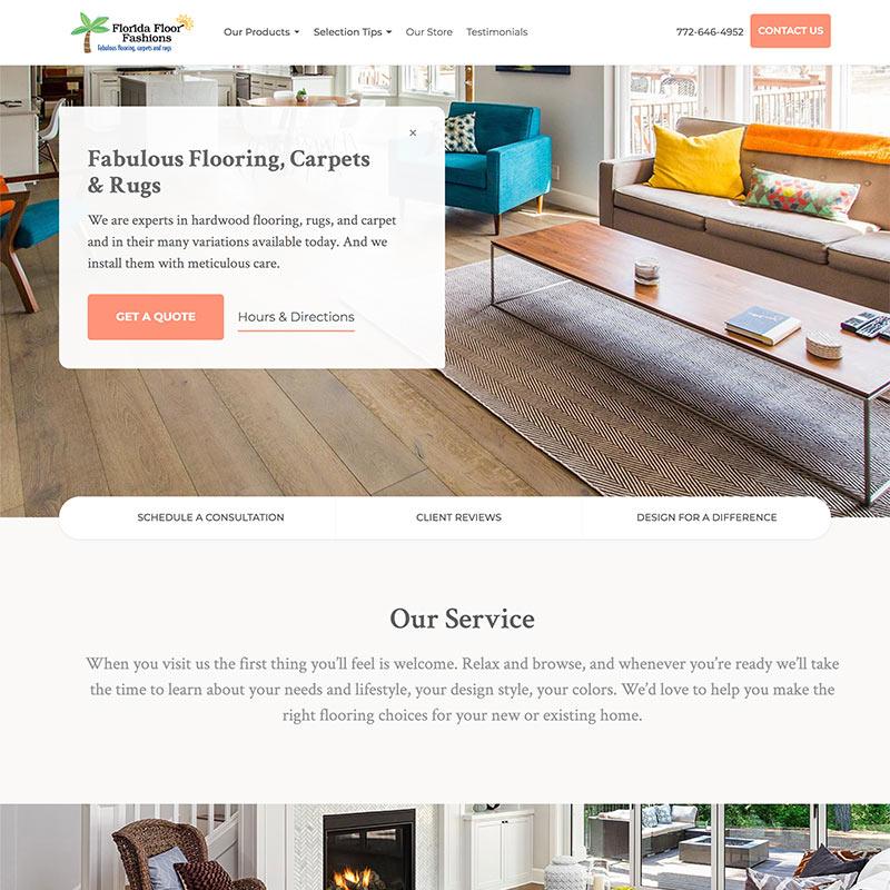
Florida Floor Fashions
Flooring Store in FL
7 Deadly Website Sins
Not so much "envy" or "greed." These cardinal sins include a weak call to action and not properly compressing your .JPG images.
Quality over quantity. You’re reading this text because you find it helpful and easy to digest.
Websites are visual. DO add photos. DO add page headings. DON’T add long, meandering paragraphs thinking that people will read it all. Users need to be able to quickly scroll through your site and still understand what’s going on at all times.
With that said, there is nothing wrong with having a lot of website content. Just make sure it’s good and relevant content that is easy to digest.
Let’s say you’re ready to buy a website. How would you reach me?
My contact info is everywhere. There are forms all over this website. We also have a chat function. Businesses with a physical address should have Google Maps with easy directions.
In other words, we don’t just have one way to reach us, we have several. And they’re obvious: If you’re on a desktop, my phone number is in the header of my website!
Weak call to action: “Call us today!”
Visitors should be compelled to call you. On this site, we’re begging you to call us in various ways. We’ve offered you a free assessment to talk about your current website. Just below this “knowledge section” we ask you for your email in exchange for more advice.
Finally, we have a sweet, sweet deal on templated landing pages that is available for a limited time.
The call to action always depends on your industry, but a good start is thinking about why the customer should feel compelled to call you. What are you giving them exactly?
Don’t ONLY try to sell products on your website. It gets boring fast.
If you’re reading this text, it means you’ve interacted with this site for quite a long time. This has happened because we are giving you the gift of knowledge.
Yes, provide unique offers on your website for those who are ready to buy. But understand that those who are not ready to buy will leave your site quite quickly if it’s one big sale pitch with no helpful information.
The first iPhone came out more than 13 years ago. For many of our clients, up to half of all traffic comes from mobile devices.
Optimizing your site for mobile doesn’t just include resizing content properly. It can also mean selectively adding or removing content depending on which device it works best on.
There are two things that affect site speed most: how large your website content is and how fast your host is. Having a slow website means customers will get frustrated and click away before they’ve seen anything!
A picture is worth a thousand words, but it also takes a thousand times longer to load than text. So what do you do?
The answer is making sure you compress and resize your images. A lot of the time, we can make photos up to 20 times smaller than what the client originally uploaded. You can likely keep all photos below 1600 pixels wide and choose a separate, smaller image to load for mobile devices.
Furthermore, compressing your images for free online, or in an application like Photoshop, can reduce images sizes by at least 3x.
The second part of the site speed equation has to do with hosting.
Yes, you can save money by buying shared hosting for $9/month, but I wouldn’t recommend it unless you are extremely price conscious or you are just making a website for fun.
Furthermore, certain hosts are optimized for specific platforms. We make WordPress websites, so we use hosting that is optimized for WordPress.
Either way, make sure a significant portion of your website budget is allocated towards a speedy host.
Websites aren’t like cars; nobody likes antiques.
If your site looks like it was made in 2008, it gives off a certain vibe. “Why isn’t this business spending time on its website? Don’t they care?”
So, yes, content and usability are king. Just make sure your site employs the clean look that people are expecting.
